Dir: unknown, 2006.
Eurodance/House.
Lyrics.
A basic, single location video lacking SFX, centred on a powerful female protagonist (the singer), tho' framing focussed on dancers' busts seems dubious. Despite the simplicity, the unusually frequent cutting to the beat, effective use of all the possibilities of the single location, and a strong performance from the singer make this a successful production likely to boost the appeal of the track.
This is a word I'll use many times in discussing this basically effective vid: simple. A simple example of narrative enigma: we fade up and tilt up to slowly reveal part of a face in CU, with half the frame given over to the mise-en-scene. It takes several shots to fully anchor the club setting, let alone the narrative of a woman setting out to pick a man. The ear-rings, hair styling and heavy make-up are also notable, so too the direct gaze which quickly emerges as a feature of this vid.
While this is obviously one of the defining, most common, features of the music vid format, we generally see this only in short sections of a typical vid. The technique, whilst not constant, features very heavily in this one - so much so that when this is dropped, the editing seems quite arbitrary and random! The opening sequence is a particularly strong example of successfully cutting to the beat, adding great impact to what seems a rather humdrum track otherwise.
SUMMARY
EDITING STYLE: CUTTING TO THE BEAT
 |
| We generally cut between varying shots multiple times per line |
What we don't see is always worth considering - no filmic titles here, or expensive SFX, let alone basic video FX (bar slo-mo) or even transitions. This is a cheaply produced (but highly effective) video, using a single location skilfully, and featuring a strong central performance from the singer, who achieves a magnetic presence (given how many shots she is in, if her performance was drab the video would simply fail).
EDITING STYLE: PACE + SHOT VARIETY
Consequently, the shot variety remains strong.
It is arguable whether we should always raise this, but once more we can debate seemingly contradictory signifiers which could be labelled feminist(ish!) or post-feminist.
 |
| Very much in control; flipping male gaze here? |
The simple narrative has a woman in control - unusually, the tables are turned in terms of voyeurism and technology: she is employing CCTV to watch the object of her desires (female gaze?). (The mode of address is very direct; she generally gazes directly at the camera) The lyrics can be read as her declaring she has chosen a man and he will be with her ... for good! (Its also worth noting that the lyrics are essentially conservative, normativising heterosexuality and monogamy!)
 |
| I really like this shot; simple but semiotically rich |
She is a confident character, physically (sexually assertive dancing) and mentally (technophilic, at least with regards to controlling the CCTV).
BUT... we also get a large number of shots where female dancer's bust are the focus of the frame, with the slo-mo making me think of the classic mainstream exploitation/male gaze example, Baywatch. That show made Pamela Anderson into a global star; few would attempt to argue that her acting skills were her key asset or the main factor behind this fame.
 |
| There is a lot of this; surely this is unarguably objectifying? |
Ultimately, then, notwithstanding the confident, assertive female protagonist, do we not have yet another example of a media product created primarily with the viewing pleasure of a male audience in mind (which is what the male gaze concept is all about)?
CINEMATOGRAPHY
 |
| Reverse tracking is used as she walks through club |
To be specific, we get reverse tracking shots: the subject walking towards the camera, but staying at a constant distance. This is a key convention of dance vids.
Furthermore, there is some (this same phrase once more...) simple but effective framing - the diamond mesh of the lift barrier is used well to provide some interesting framing.
 |
| Compare this with below: note focus + framing (rule of 3rds) |
Finally, we also see some variable focus which helps with shot variety, and is generally something worth considering.
 |
| It could be retro styling, but posters suggest E. Eur location |
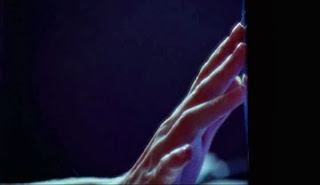
The single location could have spelled disaster, but there are a couple of simple but highly effective examples of making full use of the space. The narrow corridor just outside the bar/dance floor area is used in two ways: (1) the singer spreads both arms out to make this a tight but interesting dance space (she is able to touch both walls, and to push in towards the lense) and (2) the lights leeching out from the dance floor form an interesting spectacle.
 |
| Always look out for interesting framing/lighting opportunities |
A further example of venue lighting (I presume) being used effectively comes with the red lighting as the two emerge from the lift 0:46 in.
 |
| Basic verisimilitude(1) |
 |
| Basic verisimilitude(2); variable focus again too |


No comments:
Post a Comment