 |
| I may have blogged on Gaga once or twice already... |
IN THIS POST: Screenshots with links for both Lady Gaga's UK and USA official sites, plus LittleMonsters.com, plus a brief look at some of her social media. What emerges is a radically different approach to UK and US audiences, plus some evidence that the 'official website' is the least regarded strand of her multimedia branding, secondary to the social media output.
 |
| The hyperlinked social media logos along the bottom of the UK site's 'shop' page (which appears to actually link back to a US page, albeit prices are in £). I didn't recognise the last on the right, and had to hover it to be reminded of MySpace's logo! If anything denotes a lack of care over the official site, this is a bit of a clincher... |
 |
| From the US site; the lack of 'shares' compared to Twitter and Facebbok updates is stark, and may explain the lack of care taken with the official websites... |
Lady Gaga is discussed in many posts on this blog - check out the Lady Gaga tag - and presents a broadly exemplary case study of how artists/labels utilise UGC and fan interaction to successfully build and monetise a brand. She is also a great case study for considering the competing claims of feminist and post-feminist positions on representation within music promotion materials. Its always useful to acknowledge subjectivity, so: My age inclines me to view her as a Madonna rip-off, but there's no questioning the genuine passion radiating from much of the social media content posted by fans.
 |
| Some 40 posts to date have referenced Gaga... |
THE UK HOMEPAGE v US


I think this may reflect an expectation of greater social media usage of the US audience compared to their UK equivalents; the US website is quite simply markedly inferior to the UK site.
UK HOMEPAGE SEMIOTICS AND CONTENTS
Lets look at this in a little more detail. What is actually included? Its through listing the content, and then adding some more qualitative semiotic analysis of the media language to your more quantitative content analysis that you build up an understanding of the conventions you will reflect and/or challenge with your own designs. You will also see below that I have clicked through various links to look beyond the confines of the site, as well as doing some further googling...

 |
| The UK Gaga site as two (overlapping) screenshots |
 |
| The Gagapedia - its always useful to widen your research; don't just rely on listing what you see! |
USE OF FRAMES: This is quite a technical issue, but where you see part of the content of a website stay on screen even as you scroll, this is through using frames within the coding. That can be seen as a little old-fashioned or clunky if not used selectively and with care. Here framing is used to ensure that the main site links are always accessible - which is generally a key part of web design!
AD BANNER: I can't confirm it on the PC i'm blogging on, but I assume the black block is an ad banner that my ad-blockers have ... blocked. If not, its a quite bizarre, clumsy design feature!
SOCIAL MEDIA: Gaga's social media take precedence over her website, something that is more blatant and pronounced with her US site but still evident here too, and its no accident that there's a prominent Facebook image/link in the top frame. Note though that whilst eye-catching, it is a small (hyperlinked) image, and plentiful white space around it.
WHITE SPACE: This is a crucial consideration for print texts, but the media language of websites has much in common with print, being most commonly static and scrollable (though dynamic image galleries are common). Take care to think about the blank space around components (whether white or otherwise), and be careful to avoid clutter - its a difficult balancing act to include enough information without ruining the design.
TEN MAIN SECTIONS: Home, News, Gallery, Releases, Video, Live, Forum, Shop, Links, Register. The Doors site uses just 7 main links; ten must be close to the limit whilst still being user-friendly?
THREE SECTIONS PREVIEWED ON HOME PAGE: News, videos, links (Twitter).
1: LATEST NEWS HIGHLIGHTED: An RSS-style newsfeed comes just below the top frame, previewing the four latest 'news' stories. Note the font colouring, size variation, use of lines as dividers, thumbnails, upper case, date, and read more link.
2: VIDEOS: YouTube (from the official Vevo channel) video embedded within an elliptical frame, the shape reflecting the ArtPop design (and variations of this irregular shape used throughout the site). All upper case again, with a simple list of further videos hyperlinked, and a link to the Videos section. Its her most recent release (the Tony Bennett collaboration) that is highlighted.
3: FOLLOW GAGA [LINKS]: The top frame carries a hyperlinked Facebook graphic, and here we have direct links to her Twitter account, with a clever bit of coding meaning that you can tweet Gaga directly from this homepage, as well as follow her, and there is a live feed of her latest tweets to boot. The graphic style of this is sharp and contemporary, and again reflective of some of her existing sleeve designs (Born This Way?). Note that the hyperlinks with the tweets use shortened URLs.
MAIN LINKS ALONG BOTTOM OF PAGE: A repeat of the main links, laid out from left to right. Note that the font colour for Gaga has changed, and the font itself 'squashed' (its vertical axis is reduced, thickening the font).
SITE DESIGNER: 'site by RETROFUZZ', a hyperlinked graphic which appears on every page, as does the main links list.
OUT OF DATE...: Note how out of date the 'news' updates are on the homepage:
 |
| Screenshot from 29 Aug 2015, 'news' from January!!! |

THE GALLERY SECTION
This has very useful content for anyone researching target audience, especially a wider secondary target audience. The arrows permit easy scrolling through the gallery for each section, and the press section includes various magazine covers - The Times magazine suggests that an older, upmarket, sophisticated ABC1 audience forms part of Gaga's audience, even if it is a secondary audience. Its useful to look at any media appearance by an artist you're working on, as this can signifiy and help you evidence appeal in multiple possible audience types.
 |
| The Gallery section, zoomed out. |
 |
| A shot from the Press gallery. |
THE RELEASES SECTION
This is kept simple, with the covers of six albums pre-loaded, and discrete arrows again allowing the user to click through the singles section. Again, though, there is evidence of lack of care ... only six single sleeves are actually loaded into this. I'd be disappointed if a student showed such slackness, never mind a well-paid web designer/site manager. We again see the opacity of the background image varied (and note that these images vary in shot type, from the long shot of the gallery section to the medium close-up here) through the shapes. The simple touch of varying the shapes too for album and singles is elegant and appealing.
 |
| Releases page, zoomed out to fit. |
THE VIDEO SECTION
This is once more kept simple (and thats generally a good thing!), with hyperlinked thumbnails for 19 official videos on her Vevo channel, and discrete arrows again allowing the user to scroll these. I'm surprised at the lack of 'exclusive' website content though - perhaps this is accessible only to registered users? I would also have provided more links through sections (as the gallery page does): official videos, fan videos, behind-the-scenes, live (etc).
 |
| A by now familiar design approach, but note the clever bit of montage effect with the added nose/mouth fragment, referencing the ArtPop cover. |
THE LIVE SECTION
This is comparable to an annoying section of The Doors website, which also provides clickable dates on which nothing appears. If, for whatever reason, you wanted to go through the archive to find out when she had toured the UK, good luck, as you have to click through month by month with nothing to signify months when she did tour here.
A bit of effort might have made this into a strong feature - I imagine many fans would enjoy being able to see her gigs worlwide listed by date this way, with embedded video content (fan/official clips) highlighted. The montage effect here is somewhat clumsier too.
 |
| Well, thanks for ...? This feature is a little bit monstrous... |
THE FORUM SECTION
By this stage the laziness of the site designers/manager begins to overwhelm the strong, positive design attributes ...
This is something of a fake link, taking you to the US site's forum. Much cheaper to run fewer forums of course, assuming they're moderated, but this is one of the very biggest artists in the world, not some underfunded Indie! Links to a US/global forum alongside a UK forum would make sense here, and having some featured entries would surely be sensible?
Then again, the US site itself is even worse - the site designer hasn't bothered to remove the placeholder text (something that UK politicans can also be guilty of - see number 6 on this Indie list of buffoonish election leaflets...)

 |
| The handwriting style font is intended to signify a personal touch, as if Gaga herself oversees and reads this ... though of course there isn't anything to read, and the site designer hasn't even bothered to edit the placeholder text!!! |
THE SHOP SECTION
This appears to be the US site again, notwithstanding the £ prices - at the very least this has again gone away from the generally elegant, sophisticated style of the UK site. Note the categories of goods for sale, and the frankly ridiculous choice of social media links...
 |
| The use of the handrwiting style Gaga suggests this is also linked to the US site, notwithstanding the £ prices |
 |
| Note the social media hyperlinked logos along the bottom: Facebook, Twitter, YouTube and ... MySpace???? If you had any lingering doubt over the sense of neglect that runs through the website, this should just about clinch it!!! There's more on MySpace in the LINKS section, next. |
THE LINKS SECTION
A more elegant solution would be the inclusion of hyperlinked social media icons as part of the top frame (as with the Doors site), but this page not only recycles the same image from the gallery page (because its hard to get different images of Gaga, right; she always looks the same...), it also links to a MySpace Gaga site that clearly has been abandoned ... the link just reverts to the MySpace home page, a largely abandoned site despite multiple relaunches. That was one punt that Rupert Murdoch got badly wrong.
(Writing that I'm struck for the first time after writing over 1,000 blog posts that I'd like the option of whacking in a smiley face here...)
 |
| The list of retailers is interesting - and probably once more reflects a lack of updating (HMV?). Also, again, the use of icons would be more elegant here. |
 |
| When, in the spirit of investigation and thorough research, I clicked on the LG MySpace link ... the MySpace homepage appeared, presumably denoting that Gaga has long since abandoned this platform ... but naturally her official website can't manage to reflect this reality by bothering to update the site. |
THE REGISTER SECTION
I wonder when anyone from the UK last registered on this site? There is ZERO info or inducement: what benefits does registering bring???

THE US WEBSITE
Very briefly on this...


We can note the social media icons/links; iTunes; product shots; tour dates - all conventional features, if not as clumsily presented here.
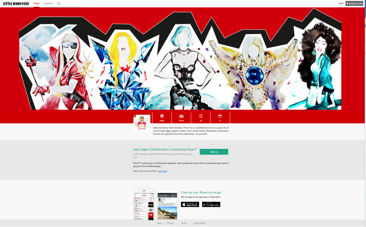
What is a little different is the Gaga charity, and her own social media site, LittleMonsters.comhttps://littlemonsters.com/
When (if!) you find and click to enter the site (typically the main image should be hyperlinked for this!!!), you get 'news':

The crux of the matter comes in something that is easily overlooked...


GAGA'S OWN SOCIAL MEDIA SITE, LITTLEMONSTERS.COM
I can't actually say much on this as its firewalled, which surprised me. I have gone through the steps to join this peculiar world, something that stands as one of the most striking successes of any artist in the web 2.0 era, as this is effectively her own rival to Twitter or Facebook.
 |
| The homepage zoomed out to fit |

 |
| Step one... |


A LITTLE BIT OF SECONDARY RESEARCH
It wasn't hard to find analysis of Gaga's online branding and social media use - she is arguably the most successful practitioner to emerge so far (though her standing seems to be in decline).
Gaga's scale online enables her management to data-mine Spotify, Facebook (etc) interaction to the extent that they can decide playlists for a city, and more, as Bernard Marr notes (November 2014; she has since lost her Facebook crown has she not?):
It turns out, Lady Gaga and her (now former) manager, Troy Carter, realized the importance of social media early on. In 2008, she was one of the first artists to begin utilizing Twitter to interact with fans. It made sense, because of her brand platform, but they soon realized that, while they didn’t own their Twitter followers or Facebook likers (Gaga has 51 million likes, more than any other person), they could drive them to their own space, LittleMonsters.com, and use the resulting data in fascinating new ways.The business magazine Forbes has also sat up and taken note of the significance of Gaga's online success, but also the unusual branding proposition: weakness and vulnerability, and normalcy are as much part of the brand as extravagance:
Gaga can customize set lists for concerts based on the listening habits of her fans in a particular locale on Spotify—be sure to play this song, leave that one out. She’s taken fan-created artwork, uploaded to her website, and printed it on t-shirts, driving merchandising sales up more than 30 percent.
In a world where celebrity culture has long smothered us with the crushing impossibilities of perfect looks, unshakable self-confidence, and the desperate need to be popular, suddenly Lady Gaga advocates the opposite. And her message is inspiring her social network followers to feel that being different is fine – perhaps nobler.The article notes how her already huge social media footstep soared when she posted a photo of herself without makeup.
And if you think Lady Gaga is satisfied with simply influencing people on her vast social network (her 75 million strong Twitter and Facebook followers could fill the states of Texas, California and New York), you’d be wrong. She’d enlisted one of the hottest new startups on the planet to help create a community for the masses.
...
No comments:
Post a Comment